The Evolution of Our DJ Brand
It all started with a blade…
1992
In reality, it started with a catch phrase from a short-lived Philadelphia radio station, WDRE, “The cutting edge of rock”. The blade was our idea, and it has remained present in our DJ branding over more than two decades.
1993
In 1993 we trademarked the blade, and this became our official logo for almost a decade. It was used on everything official from letterhead to business cards, and still appears to this day on swag like pens and t-shirts.
1995
This logo was something our screen printing guy threw together for us as a t-shirt logo, this 1995 logo never got further than t-shirts, sweats, and the ever-popular scrubs we gave away at Bar Mitzvahs and Bat Mitzvahs and Sweet 16s in the mid 1990s.
Fact: Former U.S. President Ronald Reagan wore a t-shirt with this logo printed on it.
1999
The 1990s “collegiate style” logo was an attempt to create something fun and trendy for our staff gear. Our staff loved this logo, but it was never printed on anything promotional other than staff shirts, sweats and hoodies.
2002
In 2002 the “quarter blade” logo replaced the 1993 logo as our primary branding, used on our website, business cards, staff gear and literature. This logo was originally created as a tab on our first website by our first web designer, and we liked it enough to keep it.
2014?????
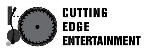
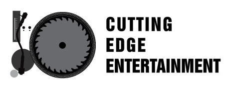
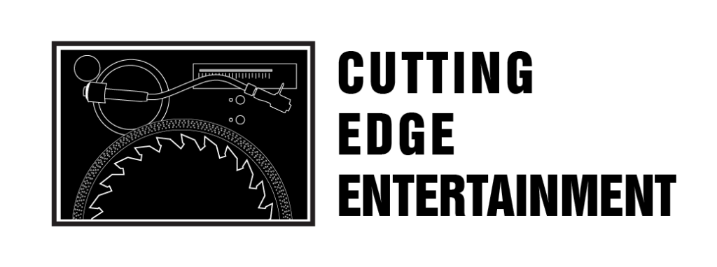
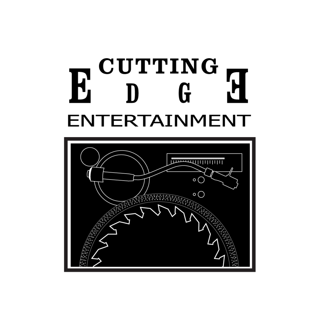
Although the first ten years of our existence saw many changes, the next decade saw none, which is why we got the itch to play with the logo a bit more, this time with more of a DJ twist, turning the blade into a vinyl record on a turntable. Our graphic artist designed four prototypes, and we haven’t quite settled on one yet.
Logo #1 with larger lettering
Logo #1 with smaller lettering
Logo #2
Logo #3
We would love to hear thoughts and opinions in the comment section of the blog post below. Tell us which one – if any – you like best. Or feel free to submit one of your own!!
We look forward to hearing your feedback!


I don’t like the new look. I had no idea that was a turntable with the blade. Hard to see the blade. If I had to pick it would be logo #1 with smaller letters. I really liked the 1999 logo with some minor changes.
LOVE the new concept, but I don’t love the design. As previously stated, it’s difficult to tell exactly what we’re looking at unless we stare at it for a moment. Maybe if the blade popped more (lighter color?), or maybe if they were two turntables? Like I said, I really like the concept. It’s a great representation for this company, but the design needs some tweaks. I really like the lettering in the 4th option.
My vote would be for Logo 1, though I think Colleen’s idea of two turntables could be interesting.